
TIME SERIES ANALYSIS OF TUCSON, ARIZONA
march 1995 to april 2024
This study looks at Tucson’s land cover changes, urban development patterns, and night light trends from 1995 to 2024. Google Earth Engine provides geospatial analysis tools and satellite imagery to make this possible. The findings could be a useful resource for Tucson residents and public agencies. The ultimate goals are to improve our understanding of the ever-changing landscape and to encourage sustainable urban development going forward.
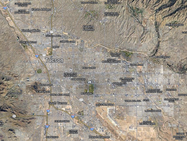
Fig. 1: Satellite imagery map of present day Tucson, Arizona
Tucson's desert climate, city light regulations, and expanding urban footprint make it a unique area of interest for this type of analysis. Time series methods are used to detect land use changes, urbanization patterns, and potential degradation to the environment over time.
METHODS
1. Create a new project of study in Google Earth Engine (GEE) and establish Tucson as the area of interest.
3. Pull Landsat data using the ee.imageCollection function, filtering the Landsat package to the defined area of interest, acquired within 1995-2024, with low cloud coverage, and including select bands.
4. Combine all collected Landsat images with the ee.merge function.
5. Use the cloud mask function to filter out clouded and low-quality pixels. Use the mapfunction to apply the cloud mask.
6. Calculate two trends: Normalized Difference Vegetation Index (NDVI) and Normalized Difference Water Index (NDWI). Add these bands to the map of filtered Landsat images.
7. Using the ee.reducerMedian function, find the median values of both NDVI and NDWI to plot in the defined area over time.
8. Plot both trends over the timeline on a scatter plot chart. The x-axis represents time (years) and the y-axis represents NDVI or NDWI values, respectively.
9. Compute the Mann-Kendall trend test for each pixel in the study area using the NDVI or NDWI time series data. The Mann-Kendall statistic measures the strength and direction of trends.
10. Plot the Mann-Kendall values as an overlay to the base map. Different colors or shades represent different trend directions: green is positive, red is negative, and white is no trend.
11. Pull nighttime lights (NTL) data from the National Oceanic and Atmospheric Administration (NOAA) for 1995.
12. Create an RGB Composite of the NTL data for the years 1995, 2005, 2015.
RESULTS
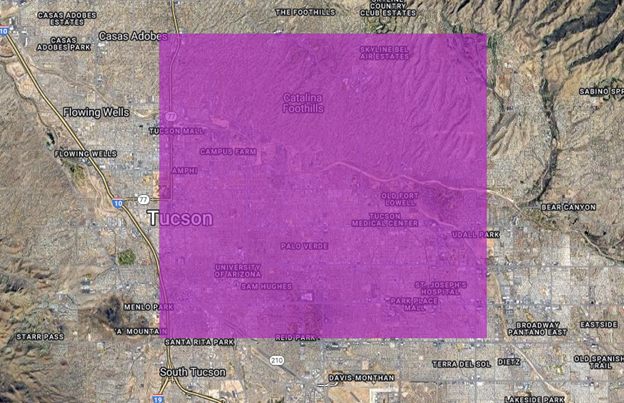
Fig. 2: Satellite imagery map of present day Tucson with defined area of interest in purple
The area of interest is labeled purple and includes much of the downtown/centro area, as well as the University of Arizona, several neighborhoods and much of the Catalina Foothills.
After acquiring and combining Landsat 5, 7, 8 and 9 imagery, and masking out cloud coverage, I computed two trends: the Normalized Difference Vegetation Index (NDVI) and Normalized Difference Water Index (NDWI). The NDVI allows for observation of changes in vegetation over time, and the NDWI allows for observation of hydrology changes over time.
I then used the ee.Reducer.median() function to find the median values of pixels in both the NDVI and NDWI to plot in charts.
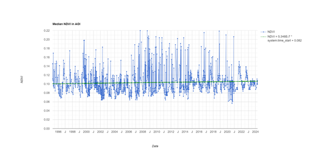
Fig. 3: Chart of Median NDVI of Tucson, 1995-03-01 to 2024-04-21
This median NDVI visualization helps identify trends and patterns in vegetation health in Tucson over time.
The ee.Reducer.median() function was used to calculate the median value across the timeline, providing a clear general trend with a median line in the chart. Focusing on median values helps to smooth out the impact of outliers, allowing for a more straightforward visual of the overall pattern. Using this function to create a median on the timeline is particularly useful to track trends without regard to the randomness that outliers can cause. This method helped me identify the central trends over time.
The outliers tell a story of seasonality as well as some random fluctuation of vegetation for a variety of reasons. Wider range NDVI plot points on the chart indicate more crops/planting for that recorded time. This chart does reflect the wide range of NDVI plots and a steady upward trend in vegetation. This can be explained by the seasonality of desert vegetation (with heavy spring blooms, etc) and different agricultural/planting patterns. The overall positive trend we see in the chart is accurately reflected in the following trend map.
The Mann Kendall test evaluates changes over time and maps those changes using a simple color coding method. Green pixels represent areas in which the median trends upward. Red indicates areas where the median trend has fallen. The white areas represent areas largely unchanged over time. Creating trend maps using the Mann-Kendall test allowed me to visually analyze spatial trends and identify areas with significant changes over time. These maps provide valuable insights for decision-making and planning.
The NDVI Trend Map shows an overall positive trend in vegetation across Tucson, with small scattered patches of negative NDVI trends.
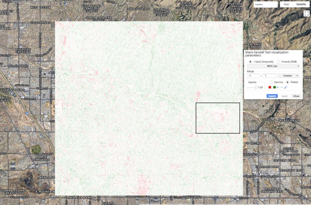
Fig.5.1: NDVI Trend Map of Tucson, 1995-03-01 to 2024-04-21
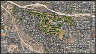
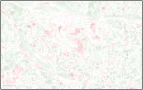
Fig.5.2: Satellite imagery of Tucson Country Club and overlay NDVI Trend Map
Fig. 5.2 shows satellite imagery and corresponding trend map overlay to the extent of the Tucson Country Club. Though we might expect the opposite for a large golf course/country club, we can see some negative trends in NDVI in the area of the country club. This could be due to a variety of factors, including (but not limited to) changes in the regular maintenance of the grounds, construction, and increased foot traffic. We see a positive trend in NDVI along the washways, which is where excessive rainfall accumulates and can feed the surrounding landscape. The foothills also exhibit positive NDVI trends. This can be attributed to the fact that a significant portion of the foothills consists of established parklands and protected forests where vegetation can thrive throughout time.
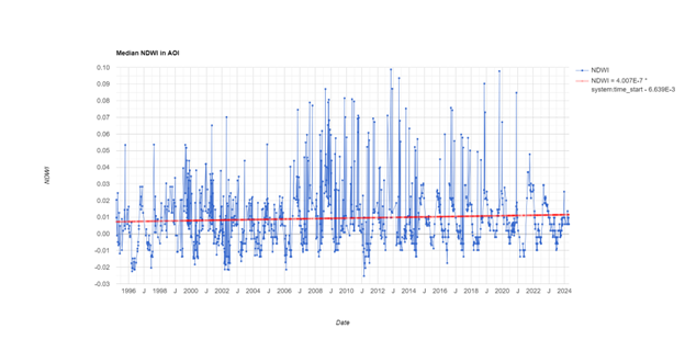
Fig. 6: Chart of Median NDWI of Tucson, 1995-03-01 to 2024-04-21
This visualization helps identify trends and patterns in water presence in Tucson over time.
Positive trends in the Chart of Median NDWI (Normalized Difference Water Index) of Tucson suggest an increase of water within the region. This could be due to various factors such as increased precipitation and effective water management efforts. Such positive trends are beneficial for sustaining ecosystems and supporting the water needs of the Tucson populace.
Conversely, negative trends in the NDWI chart signal potential water loss, raising concerns about dwindling water resources within the Tucson area. This decline could result from factors like drought conditions, excessive water consumption, or environmental degradation. Addressing such negative trends promptly becomes imperative to mitigate the adverse impacts on both the environment and the community's well-being.
Moreover, the observation of seasonality trends within the NDWI chart unveils the dynamic nature of water distribution throughout the individual years in Tucson. These fluctuations could be influenced by seasonal rainfall patterns like monsoon, regular temperature and humidity fluctuations, and/or regular agricultural practices impacting water usage. Analyzing these seasonal trends is crucial for understanding effective water resource management and planning, and can serve the Tucson community to adapt strategies according to changing conditions.
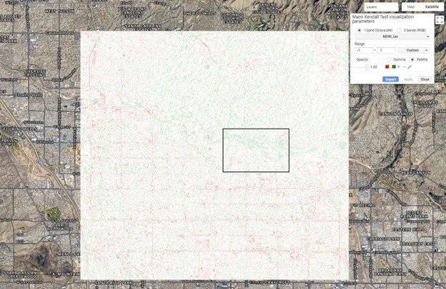
Fig. 7: NDWI Trend Map of Tucson, 1995-03-01 to 2024-04-21
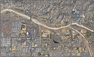
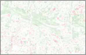
Fig. 7.2: Satellite imagery of Tucson washways and overlay NDWI Trend Map
The NDWI Trend Map
The Catalina Foothills area and the washways exhibit a positive trend in NDWI, or a general increase in water, represented in green. As expected, the more urban and developed parts of Tucson exhibit a negative trend, signaling water loss, represented in red. The desert ground remains unchanged, represented by the color white. These trends are widely expected and unsurprising in regards to seasonality trends and perhaps due to more severe monsoon seasons in recent years, with some exceptional years.
Nighttime Lights (NTL) Map of Tucson, 1995 to 2015
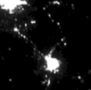
Fig. 8.1: Stable NTL (1995)
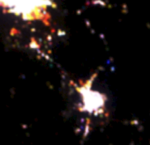
Fig. 8.2: RGB composite, Stable NTL (2015, 2005, 1995)
The Nighttime Lights Map of Tucson: The bright white cluster in the lower half of the above figures is representative of the stable nighttime city lights of Tucson. The bright cluster in the top left represents the stable nighttime lights of Phoenix.
The console metadata reveals that this image is composed of three bands, with each band named after a year, in order with the corresponding color channels used to represent each year in the composite: 2015 as red, 2005 as green, and 1995 as blue. The colors displayed tell of different kinds of changes in Tucson nighttime lights over two decades. Pixels that appear white have high brightness in all three years. We can see various areas colored red, yellow, green and blue in the outskirts of Tucson, indicating some urban sprawl over the years. Particularly interesting is the more recent (red, 2015) development reaching toward Phoenix. Yellow represents locations that began to show brightness in 2005. Red represents locations that appear bright beginning in 2015.
CONCLUSION
Tucson has experienced many changes throughout the years, including in urbanization and vegetation. Some of the trends revealed in this analysis were surprising, while other results were just as expected. The NDVI Trend Map and Chart show overall general increase from the median value over time. The NDWI Trend Map and Chart show expected seasonality trends, with an overall negative trend in urban areas and an overall positive trend in the foothills and parks areas. Bare desert ground tends to remain unchanged in both indices over time.
Nighttime lights provide valuable insights into urbanization, economic activity, and human settlement patterns. I was hoping to observe some trends relating to the City of Tucson/Pima County Outdoor Lighting Code, which aims to limit the amount of artificial light emitted from the city. Though the nighttime lights of Tucson are minimal in comparison to nearby Phoenix, this is to be expected with the significant size and population differences between the two cities. Perhaps further study of and comparison to other nighttime lights maps would reveal better insights about the impacts of such city planning techniques.
Overall, this study revealed some important information about how Tucson has changed over the years. The results of this study have implications for the future of Tucson, which can be useful for city planning, forestry, etc.
This research demonstrated to me (a first-time user) the potential of Google Earth Engine for time series analysis, highlighting the integration of nighttime lights data as a powerful tool for understanding temporal dynamics. This will serve to advise future research which is of interest to me.